
The world is unpredictable, messy, and absurd, but connection still matters. Somehow Happy is a design practice that is focused on balancing structure with spontaneity and clarity with personality. Because in a world that rarely makes sense, connecting people through design and perspective still does.
PRETTY UGLY MAGAZINE
WHY THIS PROJECT MATTERS
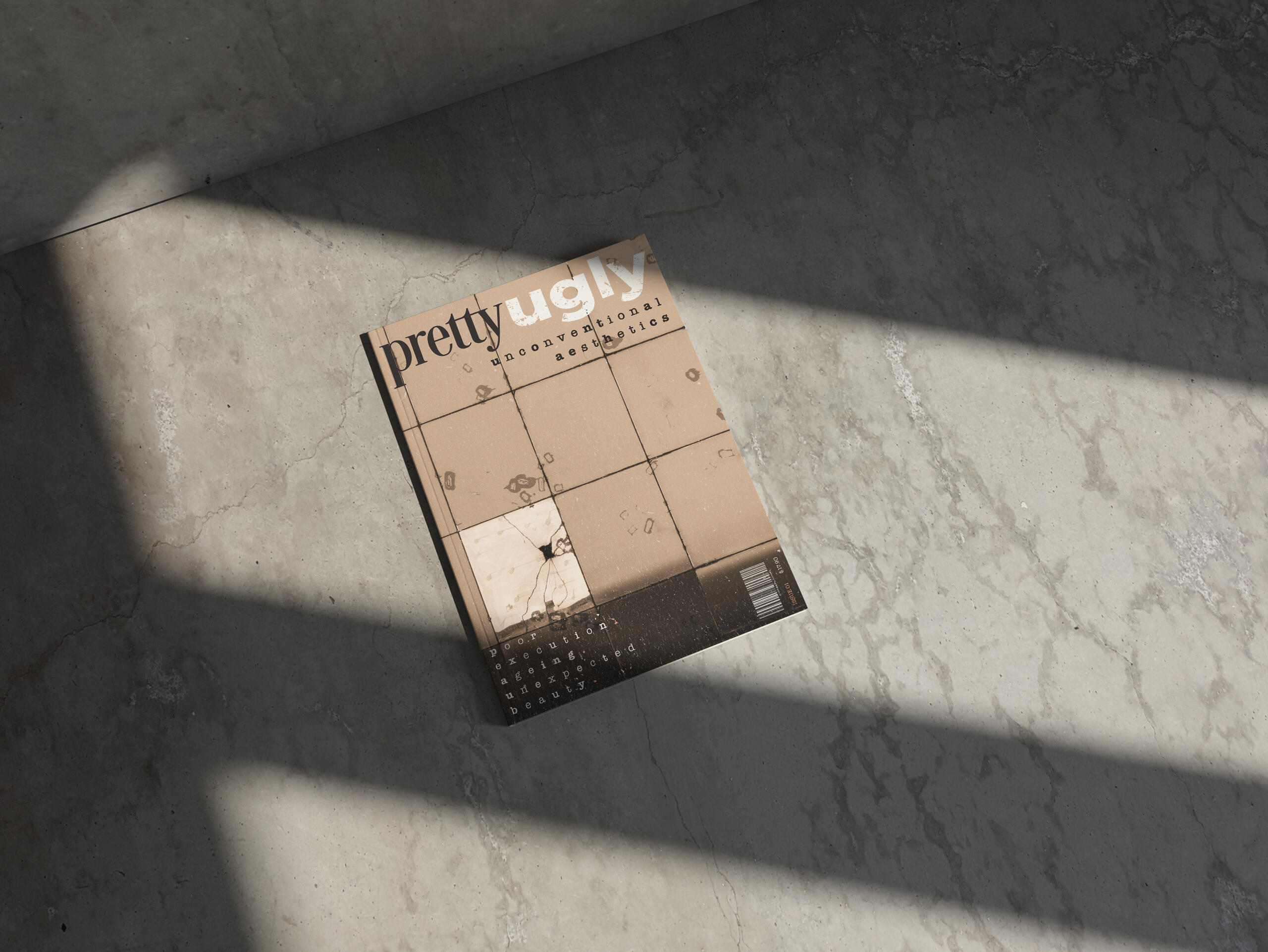
In a world where aesthetics are becoming increasingly polished and predictable, it’s easy to get stuck in one way of seeing things. Pretty Ugly Magazine challenges that by celebrating the raw, the imperfect, and the unconventional. It’s a space for young creatives in New Zealand and Australia to break free from traditional beauty standards and explore new visual perspectives.
WHAT I DID ABOUT IT
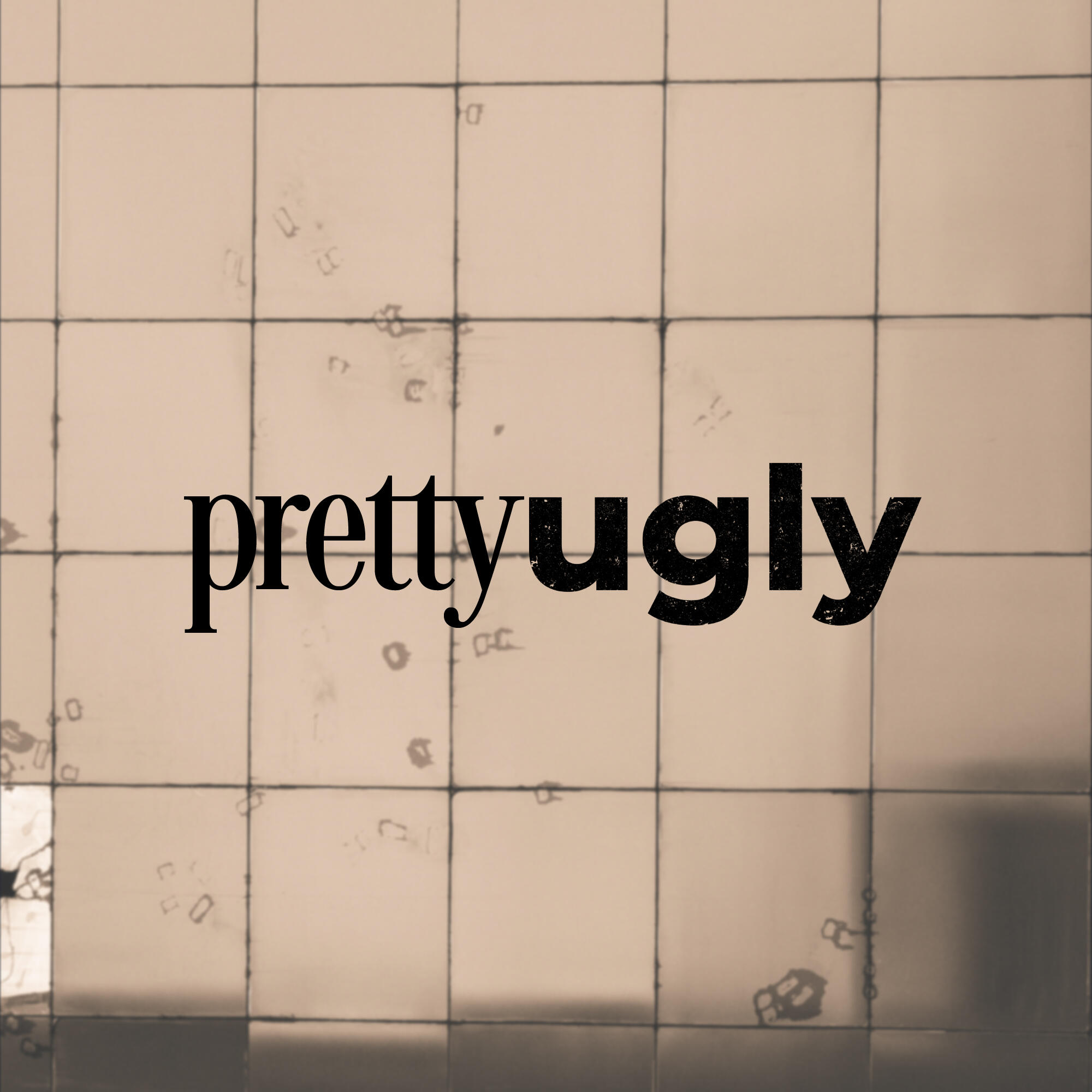
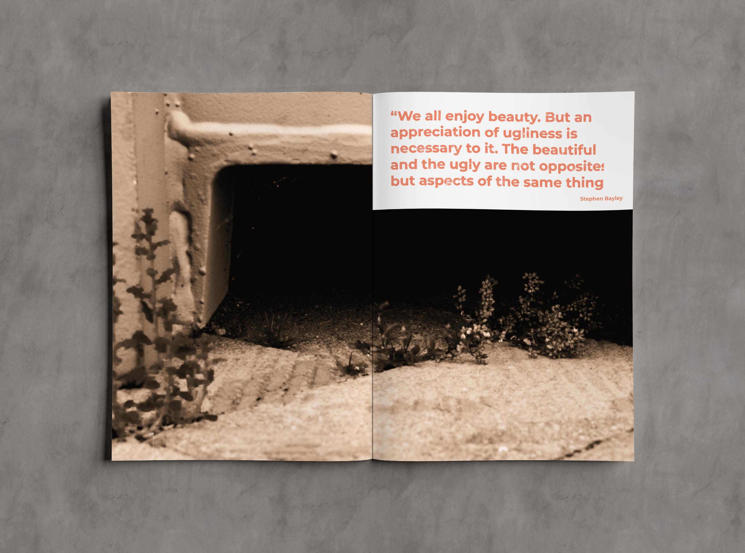
I designed Pretty Ugly Magazine as a mix of photography collections, articles, and poster-sized spreadsthat readers can tear out and use for inspiration. The design pulls from grunge, brutalism, punk, and street art, using lo-fi methods to create something that feels raw and unpolished. Every decision—from typography to layout—reinforces the idea that beauty isn’t about perfection, but about perspective.
WHY IT WORKS
Pretty Ugly Magazine doesn’t just talk about unconventional aesthetics, it embodies them. By blending thought-provoking content with an unrefined visual style, it encourages young aesthetes to break the mold and develop their own artistic voice. It’s not about rejecting beauty, but expanding the definition of it, proving that what’s considered “ugly” can be just as powerful and inspiring.
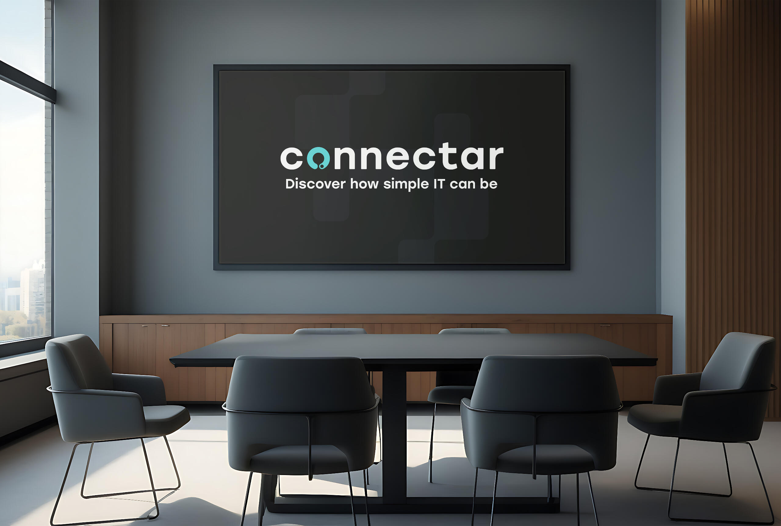
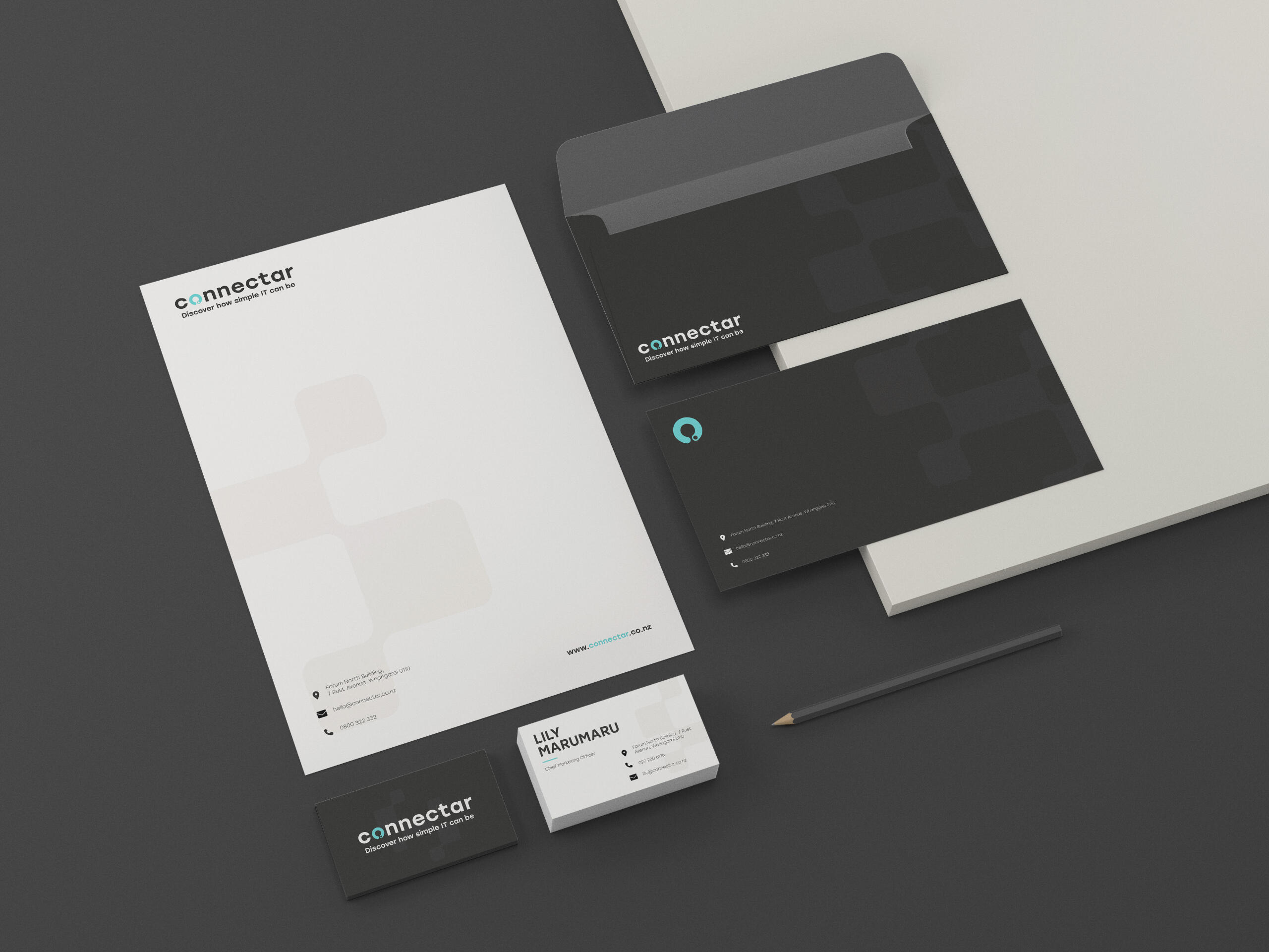
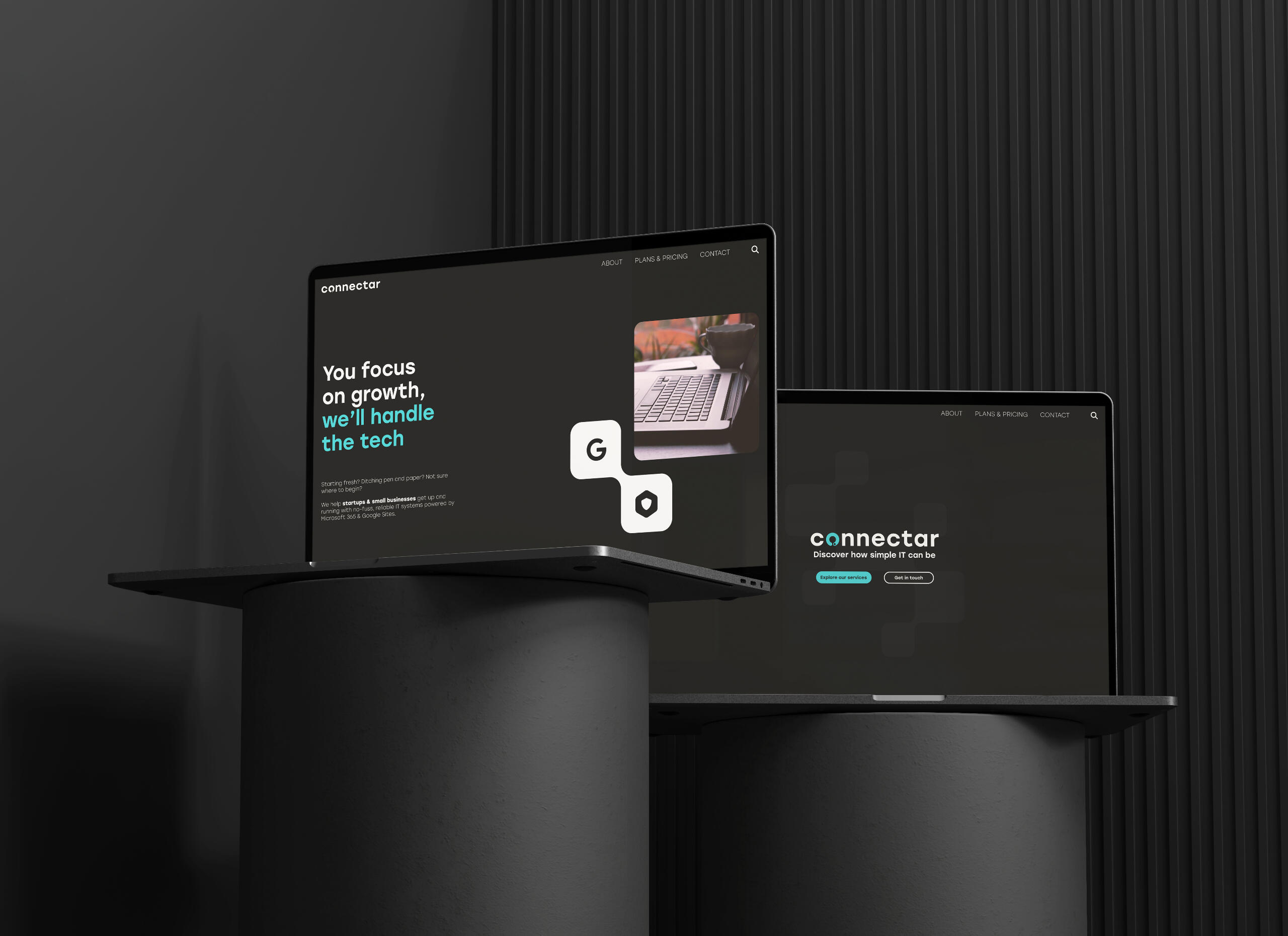
CONNECTAR LTD
WHY THIS PROJECT MATTERS
Lorem ipsum dolor sit amet, consectetur adipiscing elit, sed do eiusmod tempor incididunt ut labore et dolore magna aliqua. Ut enim ad minim veniam, quis nostrud exercitation ullamco laboris nisi ut aliquip ex ea commodo consequat.
WHAT I DID ABOUT IT
Lorem ipsum dolor sit amet, consectetur adipiscing elit, sed do eiusmod tempor incididunt ut labore et dolore magna aliqua. Ut enim ad minim veniam, quis nostrud exercitation ullamco laboris nisi ut aliquip ex ea commodo consequat.

WHY IT WORKS
Lorem ipsum dolor sit amet, consectetur adipiscing elit, sed do eiusmod tempor incididunt ut labore et dolore magna aliqua. Ut enim ad minim veniam, quis nostrud exercitation ullamco laboris nisi ut aliquip ex ea commodo consequat.
PROJECT #6

WHY THIS PROJECT MATTERS
Lorem ipsum dolor sit amet, consectetur adipiscing elit, sed do eiusmod tempor incididunt ut labore et dolore magna aliqua. Ut enim ad minim veniam, quis nostrud exercitation ullamco laboris nisi ut aliquip ex ea commodo consequat.

WHAT I DID ABOUT IT
Lorem ipsum dolor sit amet, consectetur adipiscing elit, sed do eiusmod tempor incididunt ut labore et dolore magna aliqua. Ut enim ad minim veniam, quis nostrud exercitation ullamco laboris nisi ut aliquip ex ea commodo consequat.


WHY IT WORKS
Lorem ipsum dolor sit amet, consectetur adipiscing elit, sed do eiusmod tempor incididunt ut labore et dolore magna aliqua. Ut enim ad minim veniam, quis nostrud exercitation ullamco laboris nisi ut aliquip ex ea commodo consequat.
PLAY SMART, DRINK SMART
WHY THIS PROJECT MATTERS
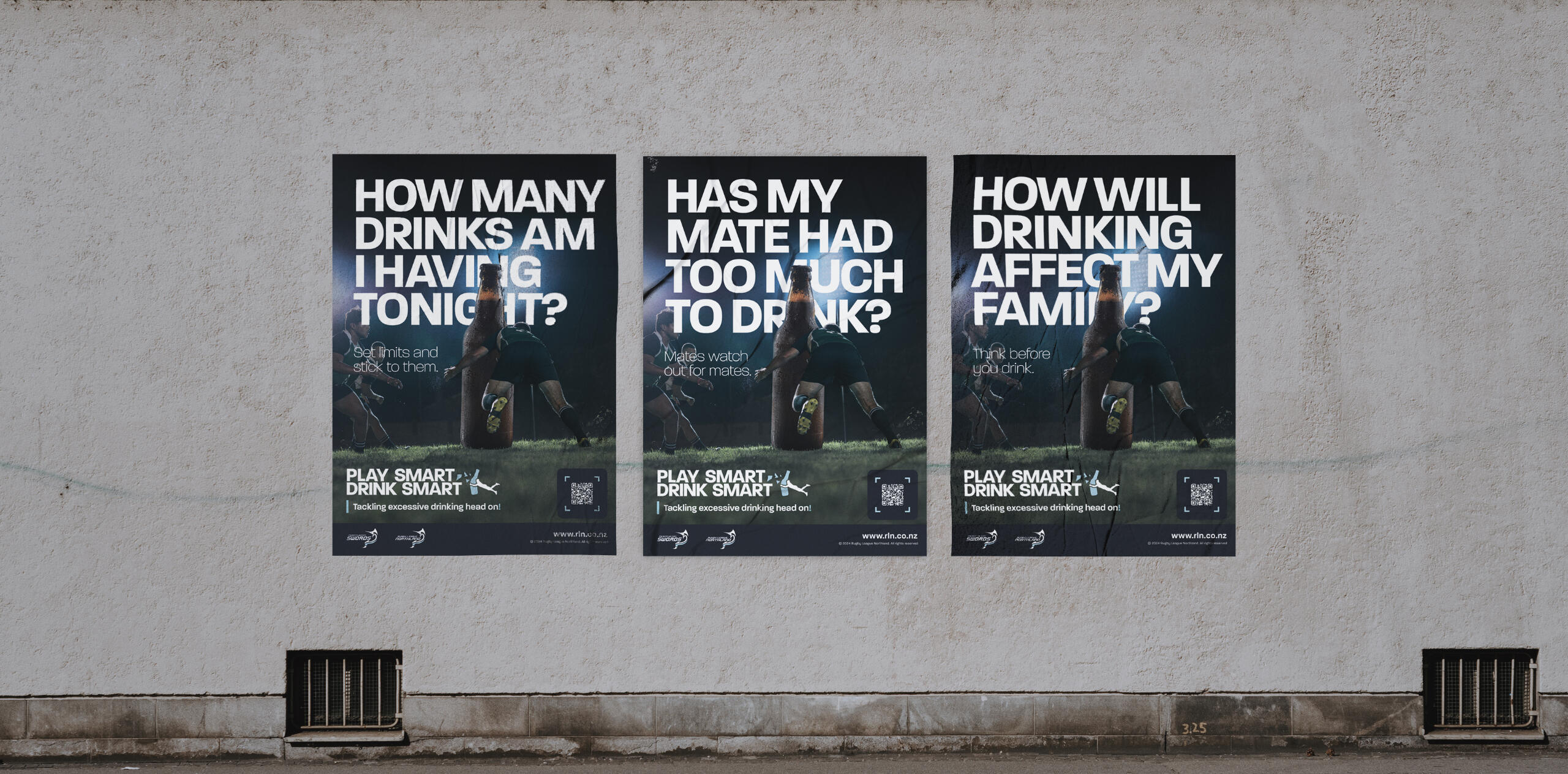
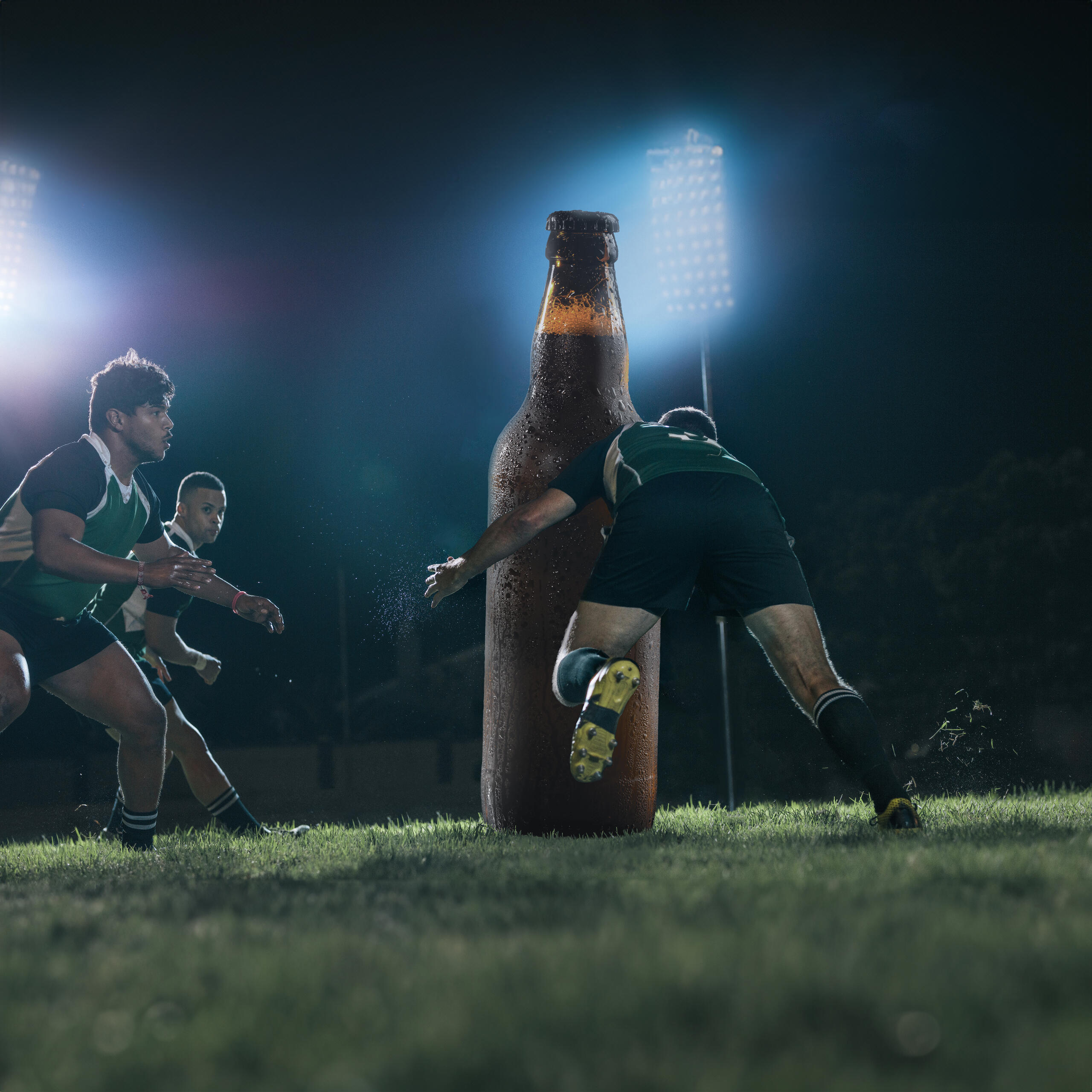
Alcohol and rugby league culture are tightly linked, but not always in a positive way. Rugby League Northland wanted to challenge unhealthy drinking habits in the community while keeping the social spirit of the game alive. Play Smart, Drink Smart encourages players and fans to enjoy rugby league responsibly without alcohol getting in the way of performance, safety, or community values.
WHAT I DID ABOUT IT
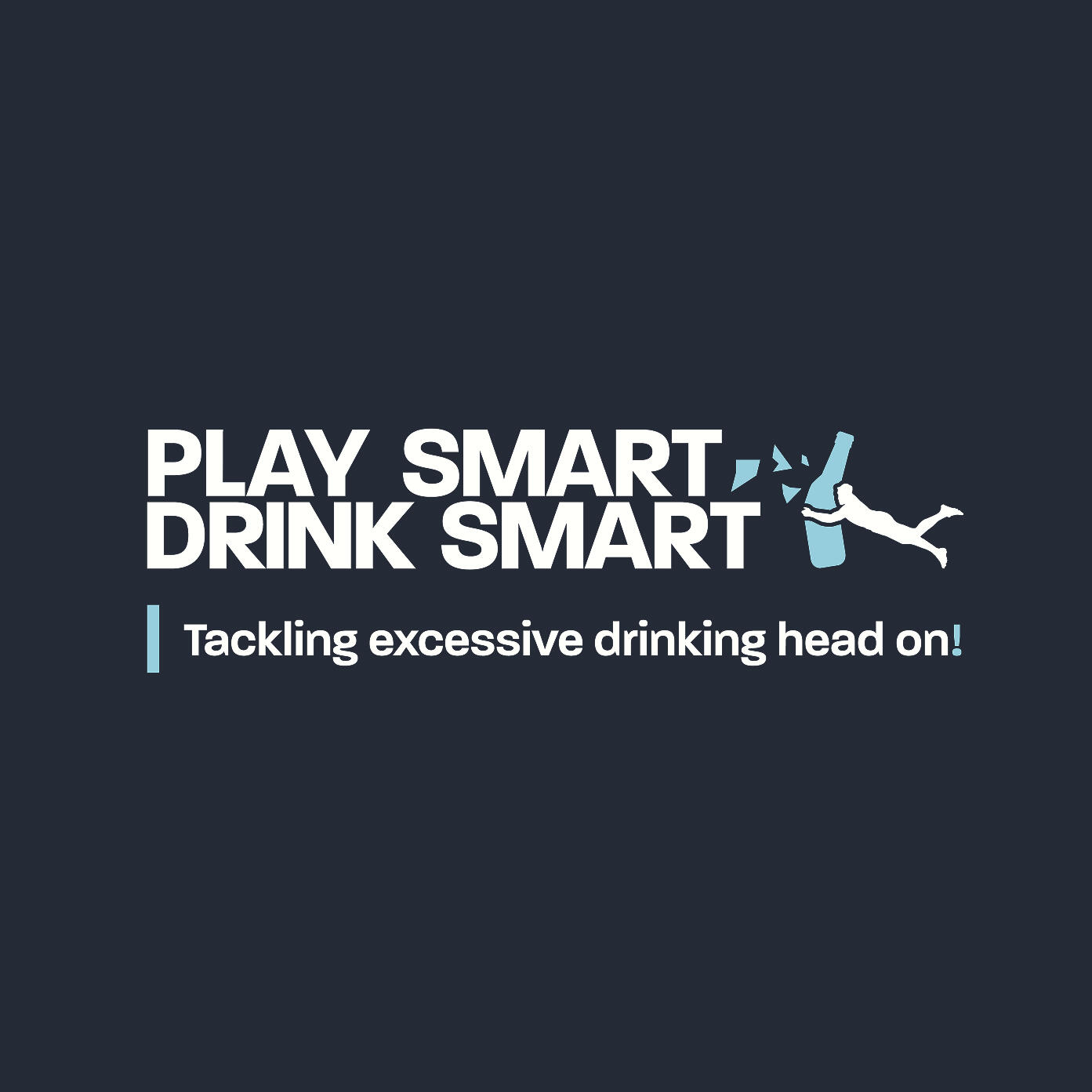
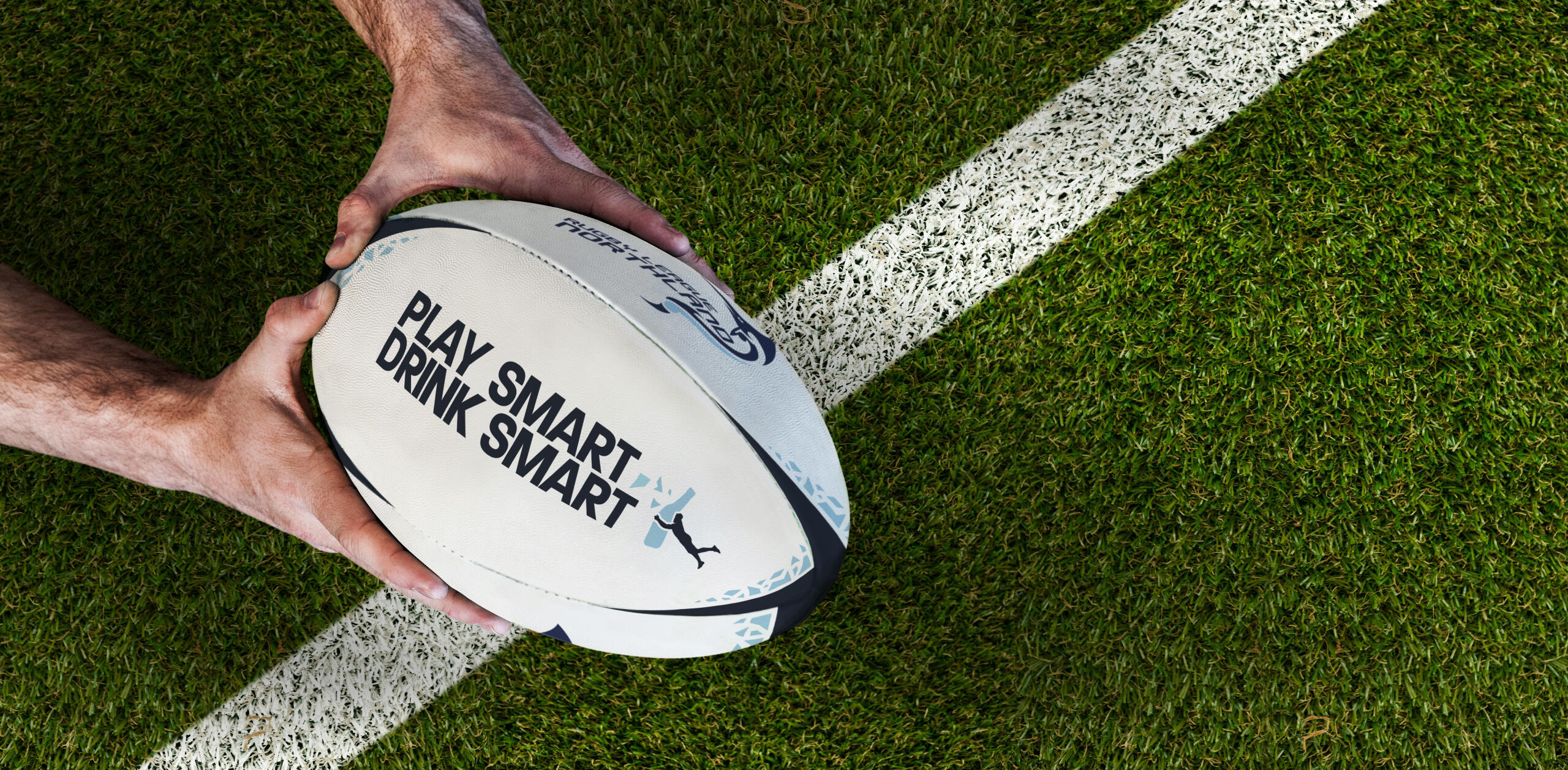
The campaign takes a on-the-nose, but supportive approach, using clear messages and a bold visual to reframe drinking as a choice rather than an expectation. A key part of this was the main hero image; a photoshopped, lighthearted take on a serious topic. By making a sort of caricature of the effects of alcohol, it caught attention while still making an important point. Alongside this, I developed graphics, posters, and social media content that highlight smart drinking habits without sounding preachy. By focusing on team values, well-being, and the balance of sport and health, the campaign stays relatable and practical.
WHY IT WORKS
Play Smart, Drink Smart doesn’t shame drinking, but instead shifts the focus to playing at your best and looking out for your team. The hero image sets the tone, making the message approachable rather than heavy-handed, which resonated more with the target audience. By blending humor with a clear message, the campaign speaks to rugby players and fans in a way that feels natural, not forced, making responsible drinking a part of the game-day culture instead of a rule to rebel against.
BLACKTOP CO
WHY THIS PROJECT MATTERS
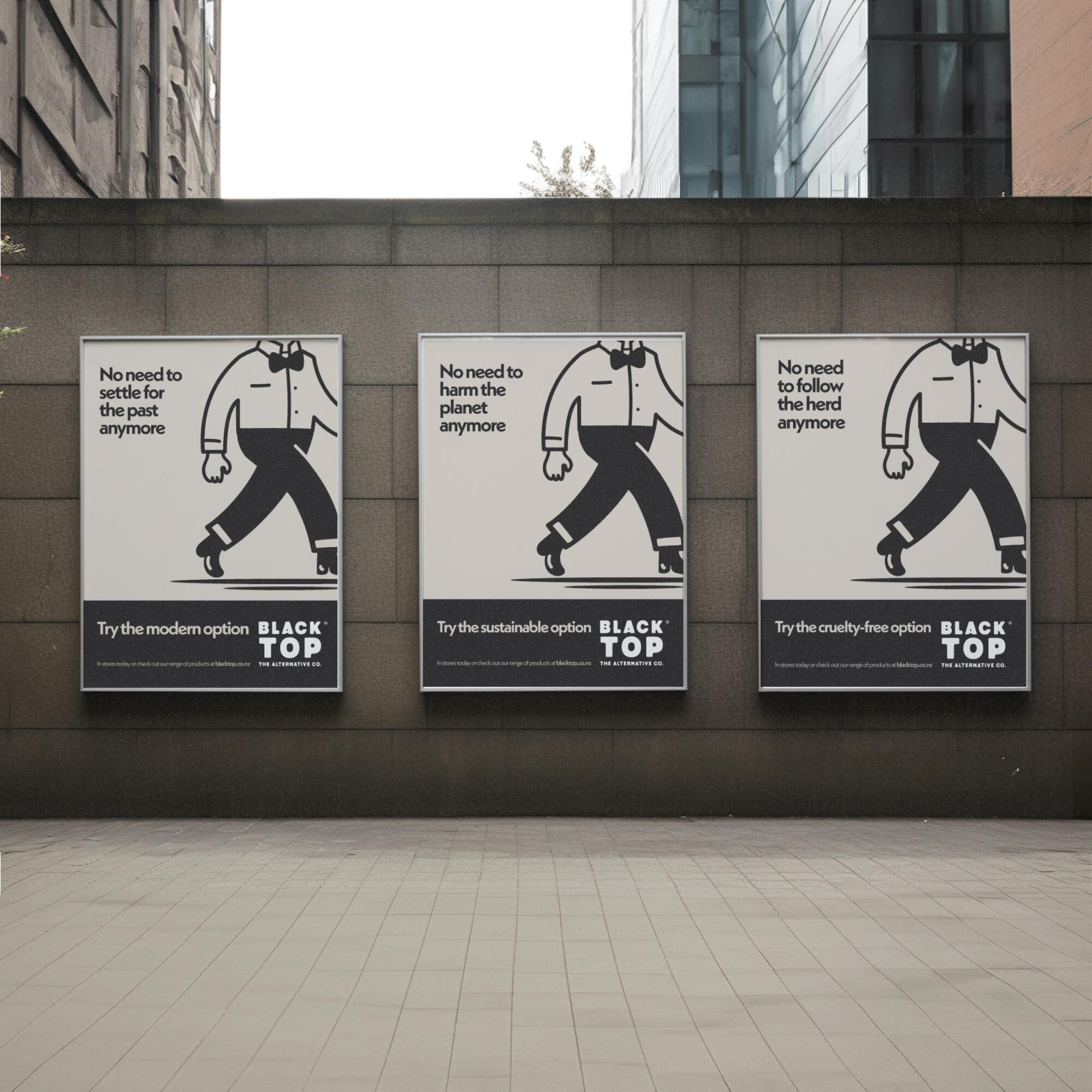
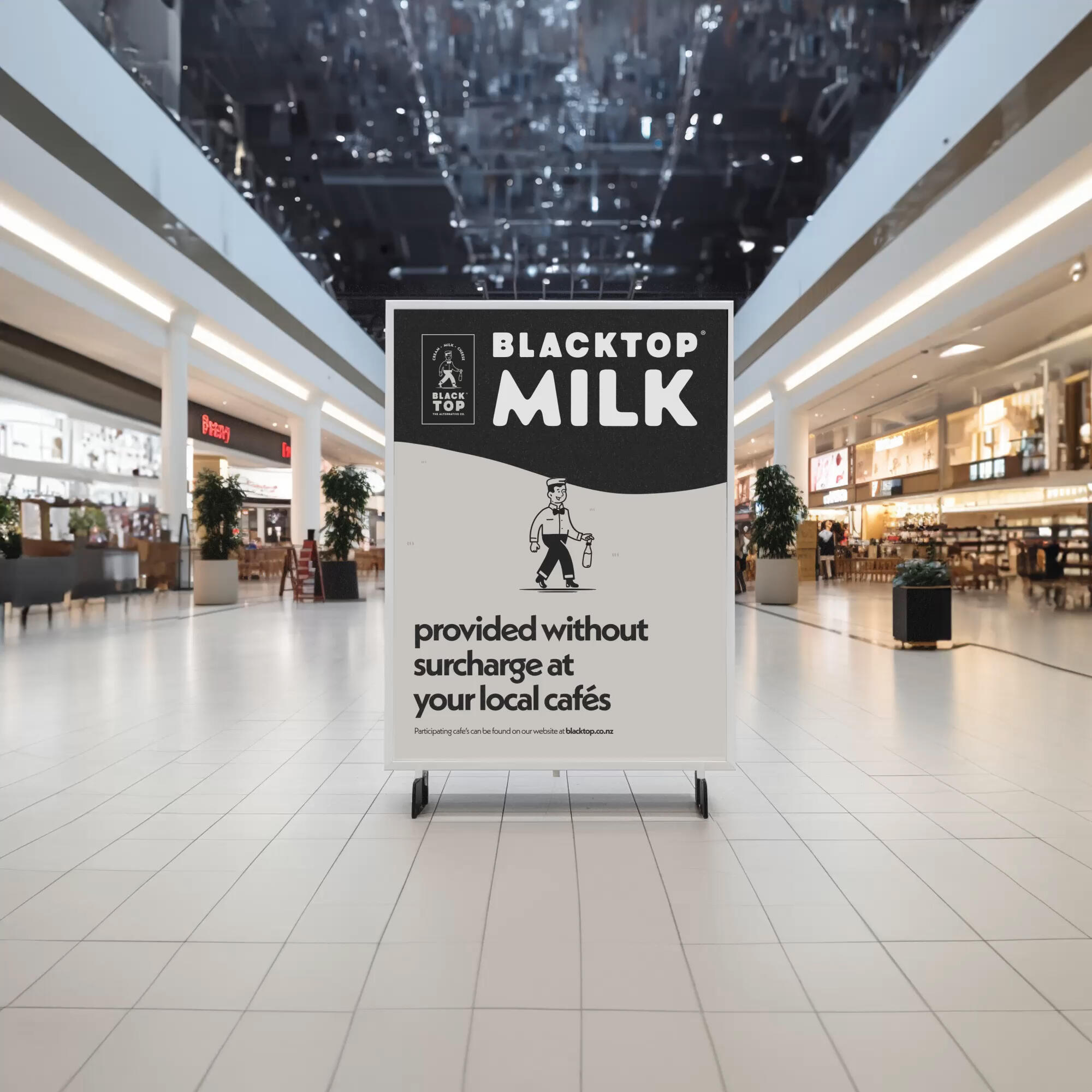
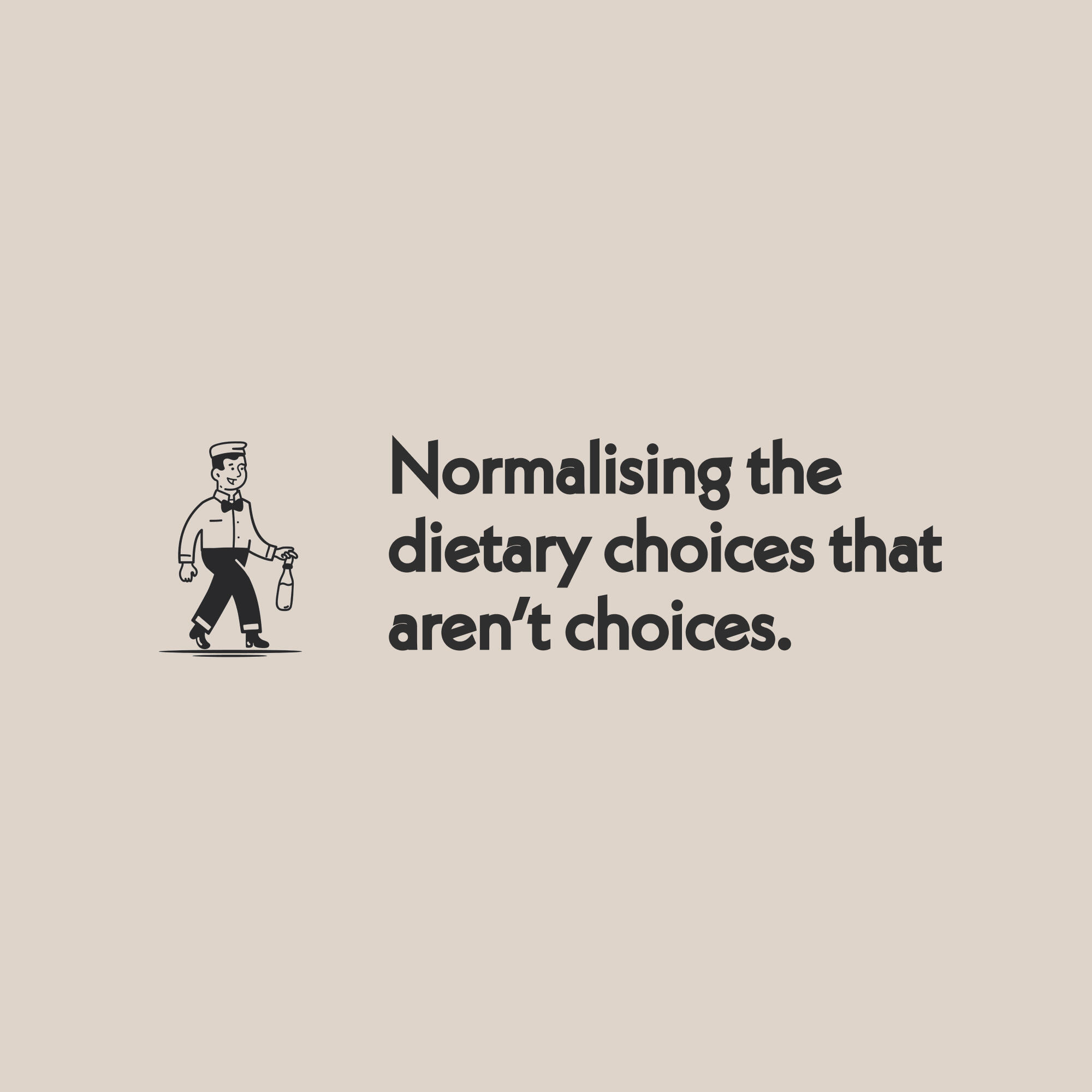
Alternative food products still face stigma, making them less accessible and more expensive. Despite advances in food science, dairy remains the norm due to outdated habits and unfair pricing. Surcharges on plant-based options reinforce the idea that they are 'extra' rather than standard. BLACKTOP CO challenges this, positioning dairy as outdated instead of shaming its consumers.
WHAT I DID ABOUT IT
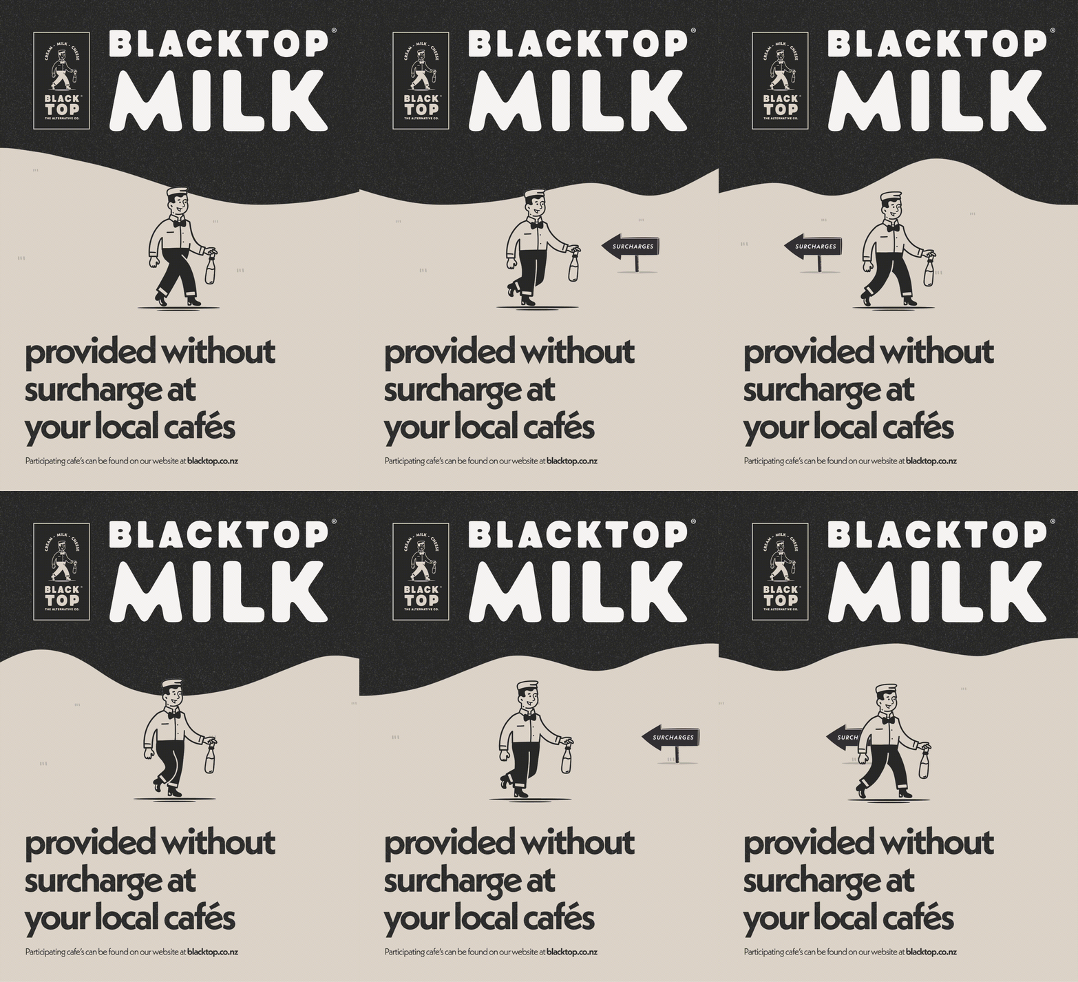
BLACKTOP CO uses humor and disruption to reframe the conversation. Our ‘reject copy’ flips the narrative, making dairy drinkers the unconventional choice. Inspired by 1930s-40s American dairy packaging, BLACKTOP CO’s branding is bold, nostalgic, and familiar, standing apart from the typical ‘clean and green’ plant-based aesthetic. Instead of sitting in the ‘alternative’ aisle, BLACKTOP CO competes directly with dairy, reinforcing its status as the new standard.
WHY IT WORKS
BLACKTOP CO isn’t just another plant-based brand—it’s a market disruptor. By blending cultural nostalgia with bold messaging, it shifts the conversation from substitution to evolution, filling the gap between premium-priced alternatives and outdated norms.
CONVENIENT WARNINGS
WHY THIS PROJECT MATTERS
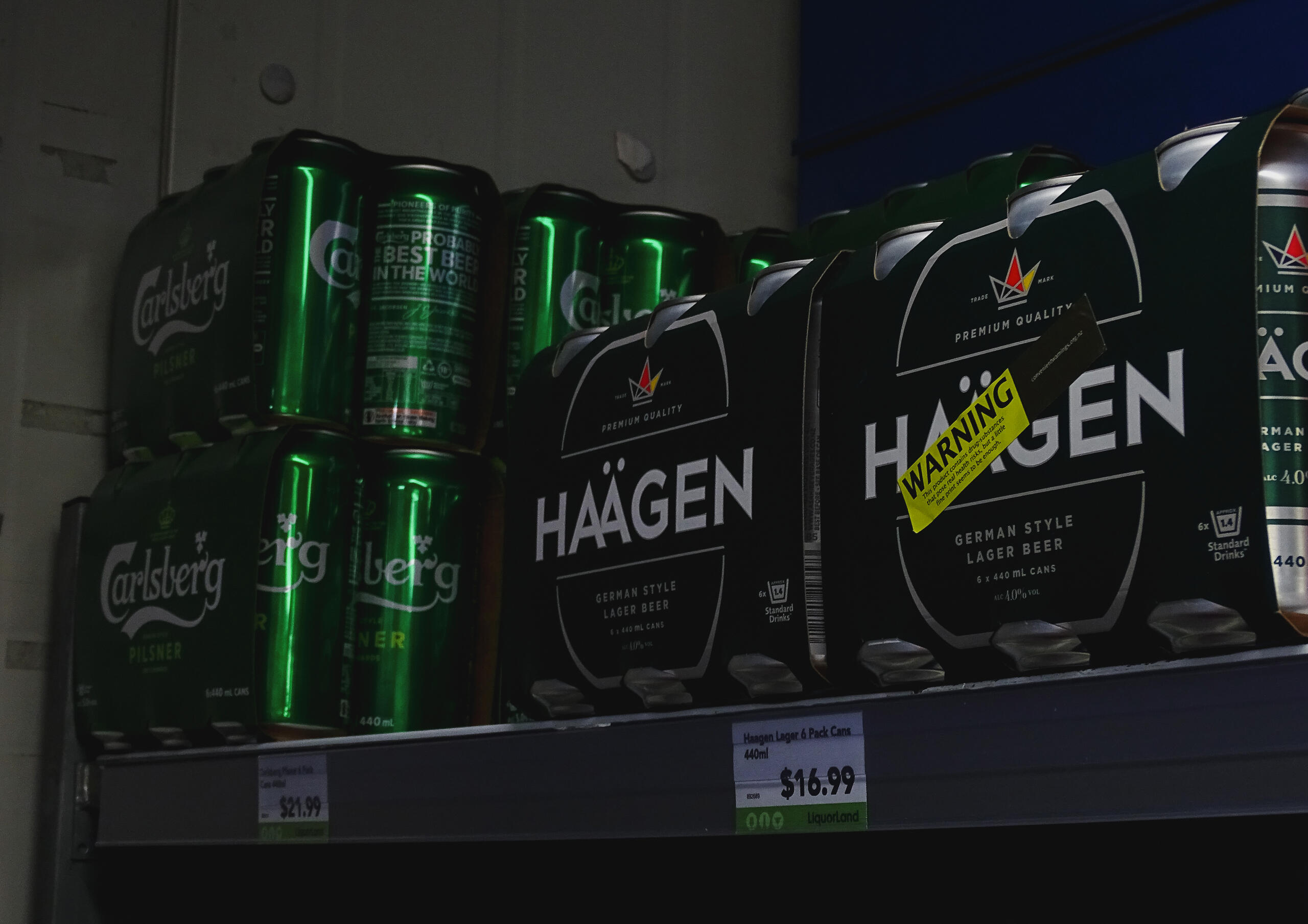
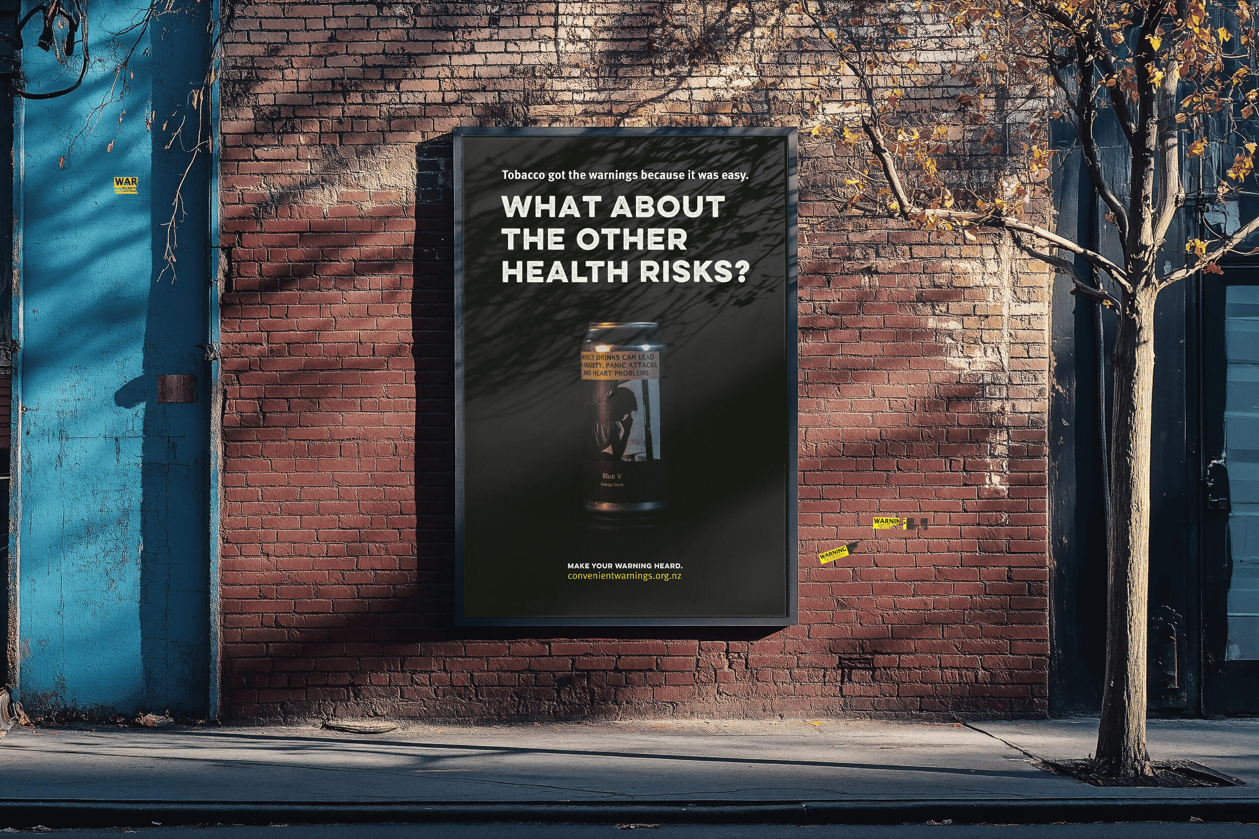
Health warnings in New Zealand aren’t exactly consistent. Cigarettes come covered in graphic warnings, while alcohol, energy drinks, and over-the-counter meds, despite their own risks, get off easy. This project points out that double standard and asks: if we’re serious about public health, why aren’t we treating all harmful products the same way?
WHAT I DID ABOUT IT?
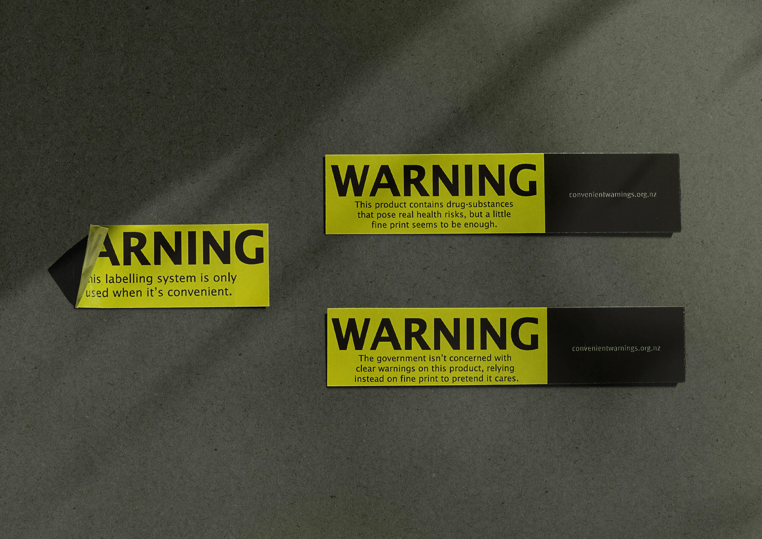
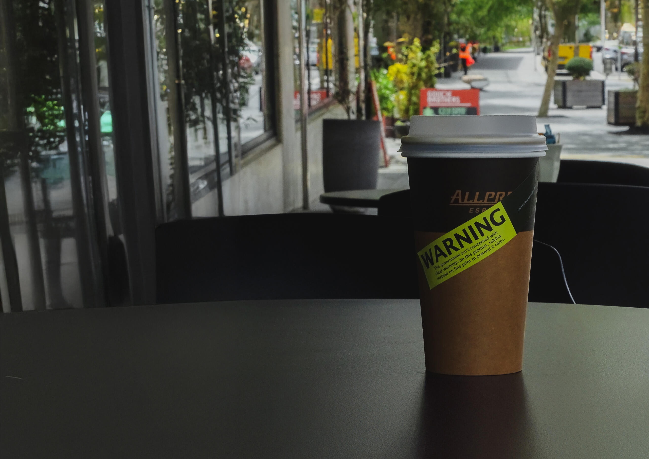
I took everyday products like beer bottles, energy drinks, and painkillers and redesigned their packaging with cigarette-style warnings. Using a bold cut-and-paste aesthetic inspired by Dadaism, I subverted what we expect to see on these products. The mix of packaging design and staged photography made them look unsettling and real, forcing at least a second glance.
WHY IT WORKS
Convenient Warnings makes the invisible visible. By applying intense health warnings across different products, it exposes the selective way risks are communicated. The visuals feel both familiar and jarring, making it hard to ignore the message. Instead of telling people what to think, the project challenges them to question why some dangers are highlighted while others are overlooked.
About Sean
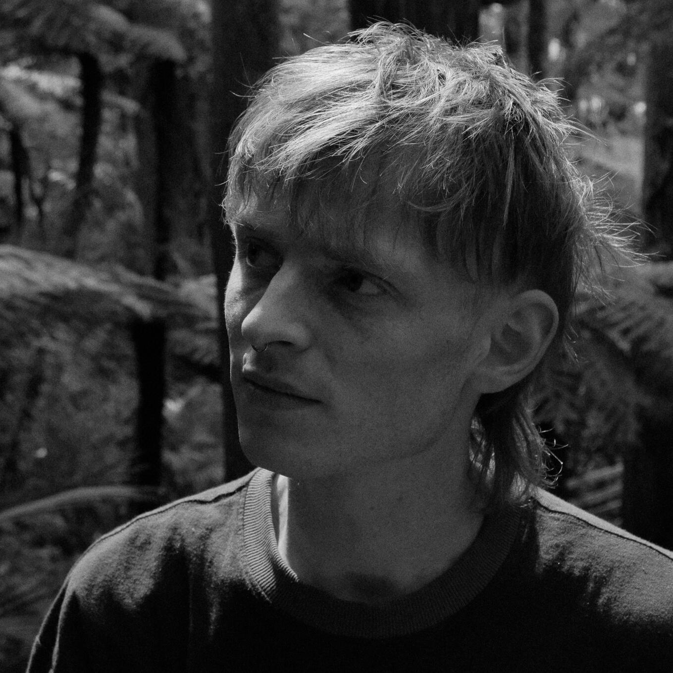
I’m Sean, a graphic designer and artist, passionate about finding meaning in the chaos. With a degree in design, I’ve come to realize that the most powerful thing we can do in this unpredictable world is connect with others. Whether it's helping people understand a brand's purpose or creating designs that bring people closer together, I believe that connection is the key to everything. I see my work as a tool to foster that connection—because in a world that doesn’t always make sense, meaningful relationships still do.
About Somehow Happy
Somehow Happy is a design practice that blends graphic design and social media marketing services. Born out of my personal philosophy, the studio exists to help brands make real connections with their audiences. The work I do here isn’t about just creating visually appealing designs—it’s about striking the perfect balance between structure and spontaneity, clarity and personality. I help brands communicate in a way that is impactful, memorable, and authentic, all while navigating the absurdity of the world we live in.
about my work
Here's a breakdown of the design and marketing services I currently offer:
· Branding systems (logos, guidelines, etc.)
· Marketing materials (posters, flyers, stationery)
· Posters for advertising or advocacy
· Light motion design and 3D work
· Social media account management
· Social media content creation (posts, stories, etc.)
· Engagement with audiences and community management
· Brand-specific copywriting that reflects your unique tone of voice
about working together
I’m passionate about design and dedicated to making it my full-time focus. While I do enjoy the flexibility of freelance work, I’m eager to contribute my skills and creativity to a design firm, where I can grow and collaborate with a team. I’m open to both freelance and full-time opportunities, with a commitment to delivering high-quality, thoughtful design work.


